Analysis of web site visits in relation to election periods
We have analysed visits and visitor numbers to our website over five year covering the past three elections (one ACT in 2016, and two federal in 2016 and 2019).
The figure shows visits and visitor numbers from 2015 up to the middle of August 2020. The pale blue bars are the federal elections; the yellow bar is the ACT election.
Numbers of visitors and visits to CAPaD’s website increased in the periods leading up to all three elections monitored. Increased downloads of election related material also occurred during these periods.
It is reasonable to conclude that voters, and perhaps others, are interested in and accessing the election related material CAPaD is making available, particularly during elections.
NOTE: these are the numbers of visits / visitors up to the end of August.


Analysis of a relationship between putting in a candidate statements and votes received
For the 2016 ACT election, we wondered if there might be any correlation between candidates putting in a candidate statement and the number of votes they received.
Surprisingly there is.
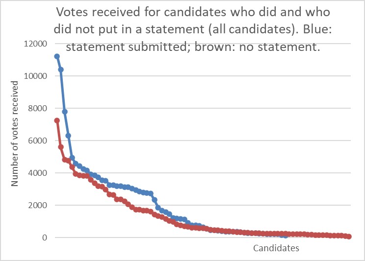
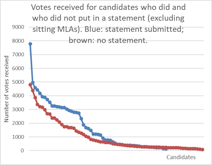
Candidates putting in a statement on average received marginally but statistically significantly higher numbers of votes than those who didn't.
The figures show that candidates putting in statements in (the blue lines) tended to receive more votes than those not (brown lines). The left hand figure shows results for all candidate including sitting MLAs. The right hand figure show results when sitting MLAs are taken out. Y-(left upright) axis is the number of votes received; X-(bottom) axis are each of the candidates.
However, we cannot claim there is a causal link. There are many reasons why there might be a correlation. For instance, candidates who put in a statement might be attractive to voters for other reasons or might be more active in reaching out to voters on a number of other fronts.
